Viler Smiler

Less is more. It’s a principle for good writing, not an unalterable law. And one of the best expositions of the principle was given by A.E. Housman in his lecture “The Name and Nature of Poetry” (1933):

Dryden’s translation [of The Canterbury Tales] shows Dryden in the maturity of his power and accomplishment, and much of it can be honestly and soberly admired. Nor was he insensible to all the peculiar excellence of Chaucer: he had the wit to keep unchanged such lines as ‘Up rose the sun and up rose Emily’ or ‘The slayer of himself yet saw I there’; he understood that neither he nor anyone else could better them. But much too often in a like case he would try to improve, because he thought that he could. He believed, as he says himself, that he was ‘turning some of the Canterbury Tales into our language, as it is now refined’; ‘the words’ he says again ‘are given up as a post not to be defended in our poet, because he wanted the modern art of fortifying’; ‘in some places’ he tells us ‘I have added somewhat of my own where I thought my author was deficient, and had not given his thoughts their true lustre, for want of words in the beginning of our language’.

Let us look at the consequences. Chaucer’s vivid and memorable line

The smiler with the knife under the cloke

becomes these three:

Next stood Hypocrisy, with holy leer,
Soft smiling and demurely looking down,
But hid the dagger underneath the gown.

Again:

Alas, quod he, that day that I was bore.

So Chaucer, for want of words in the beginning of our language. Dryden comes to his assistance and gives his thoughts their true lustre thus:

Cursed be the day when first I did appear;
Let it be blotted from the calendar,
Lest it pollute the month and poison all the year.

Or yet again:

The queen anon for very womanhead
Gan for to weep, and so did Emily
And all the ladies in the company.

If Homer or Dante had the same thing to say, would he wish to say it otherwise? But to Dryden Chaucer wanted the modern art of fortifying, which he thus applies:

He said; dumb sorrow seized the standers-by.
The queen, above the rest, by nature good
(The pattern formed of perfect womanhood)
For tender pity wept: when she began
Through the bright quire the infectious virtue ran.
All dropped their tears, even the contended maid.


• “The Name and Nature of Poetry” (1933) by A.E. Housman — more of “less is more”

El Sabor de Salvador

“Más es menos” is Spanish for “more is less”. And you can certainly see “más es menos” at work in the paintings of that greatest of Spaniards, Salvador Dalí. The more technically skilled and detailed his art became, the less powerful and interesting it was. Compare Sleep, from 1937…

Le Sommeil (Sleep), 1937

…with Still Life — Fast Moving from 1956:

Still Life — Fast Moving,1956

Witch Switch

Below is one of the best album-covers I’ve ever seen. It’s a triumph of subtlety and simplicity:

Burning Witch, Crippled Lucifer (1998)


The American blackened doom sludge-sters Burning Witch used Sorgen / Sorrow (1894-5), a painting by the Norwegian painter Theodor Kittelsen (1857-1914), to conjure an atmosphere of despair and darkness. Here is the original painting, skilfully combining snow, darkness and despair:

Theodor Kittelsen, Sorgen (1894-95)


But while the painting and album are good examples of less-is-more, the album is also an example of less-and-more. Part of its power comes from the contrast between the simplicity of the wandering figure and the complexity of the scripts used for the band’s name and album title:

Crippled Lucifer (detail)


Usually images are more detailed than writing. Here it’s the reverse. And while you can easily read the writing, despite its complexity, you can’t “read” the figure, despite its simplicity. Kittelsen’s skilful simplicity raised questions that can’t be answered. Is the figure male or female? Why is it sorrowful? Where is it going?

Well, you can say where it’s going in one sense: it’s walking from left-to-right. And that made me wonder whether the album could have become even starker in its contrasts. If you’re literate in Norwegian or English, you naturally read images from left-to-right, because that’s the direction of the Roman alphabet. On the album, you read the figure and the writing in the same direction. They contrast starkly in other ways, but they don’t contrast there. So let’s try making them contrast there too. Compare these two versions of the cover:

Crippled Lucifer (original cover)


Crippled Lucifer (figure-and-snowscape mirrored)


I think there’s something emptier and more despairing in the mirrored figure, walking from right-to-left. On the original cover, the figure is in some sense walking into the future, despite the weight of sorrow it carries. As we read from left to right along a piece of writing, what’s to the left of our eye is the past, and what’s to the right is the future. The figure carries the same implication. And because the figure moving towards the highly-complex-but-perfectly-intelligible band-name-and-title, there’s almost an implication that its story will be told, even if it’s moving towards death or suicide.

When the image is mirrored, all that disappears. Moving from right-to-left, the figure seems to be walking into the past, not the future. It’s no longer near or moving towards the complexity-and-intelligibility of the band-name-and-title. It’s abandoning the world more strongly: there’s no hope, no future, no implication that its story will be told.

I think the same happens, though less strongly, when the original painting is contrasted with a mirrored version:

Sorrow (original)


Sorrow (mirrored)


The contrast is less stark because, unlike the album-cover, there’s no complex patch of writing in the painting and the figure is moving away from what writing there is: the artist’s signature in the bottom left. In the original, the figure is abandoning identity and intelligibility by moving away from the signature. That’s why I’ve removed the signature in the mirrored version of the painting. It would be anomalous on the right, whether or not it was mirror-reversed, and it would be anomalous if it stayed on the left.

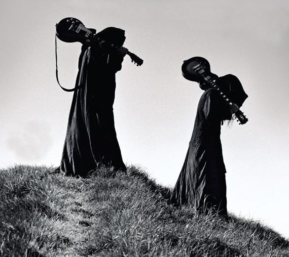
Finally, here’s a photo of two musicians in Sunn O))), the band into which Burning Witch eventually evolved:

Sunn O))) in black robes


In the original, Stephen O’Malley and Greg Anderson are walking from right-to-left. Here’s a mirrored version for comparison:

Sunn O))) photo (mirrored)


I think the original photo has more power, because the robed figures are walking against the grain, as it were — against the direction in which our Roman-alphabet-conditioned eyes read a photo.