
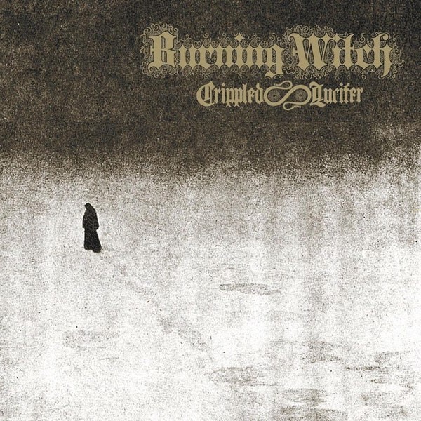
Below is one of the best album-covers I’ve ever seen. It’s a triumph of subtlety and simplicity:

Burning Witch, Crippled Lucifer (1998)
The American blackened doom sludge-sters Burning Witch used Sorgen / Sorrow (1894-5), a painting by the Norwegian painter Theodor Kittelsen (1857-1914), to conjure an atmosphere of despair and darkness. Here is the original painting, skilfully combining snow, darkness and despair:

Theodor Kittelsen, Sorgen (1894-95)
But while the painting and album are good examples of less-is-more, the album is also an example of less-and-more. Part of its power comes from the contrast between the simplicity of the wandering figure and the complexity of the scripts used for the band’s name and album title:

Crippled Lucifer (detail)
Usually images are more detailed than writing. Here it’s the reverse. And while you can easily read the writing, despite its complexity, you can’t “read” the figure, despite its simplicity. Kittelsen’s skilful simplicity raised questions that can’t be answered. Is the figure male or female? Why is it sorrowful? Where is it going?
Well, you can say where it’s going in one sense: it’s walking from left-to-right. And that made me wonder whether the album could have become even starker in its contrasts. If you’re literate in Norwegian or English, you naturally read images from left-to-right, because that’s the direction of the Roman alphabet. On the album, you read the figure and the writing in the same direction. They contrast starkly in other ways, but they don’t contrast there. So let’s try making them contrast there too. Compare these two versions of the cover:
Crippled Lucifer (original cover)
Crippled Lucifer (figure-and-snowscape mirrored)
I think there’s something emptier and more despairing in the mirrored figure, walking from right-to-left. On the original cover, the figure is in some sense walking into the future, despite the weight of sorrow it carries. As we read from left to right along a piece of writing, what’s to the left of our eye is the past, and what’s to the right is the future. The figure carries the same implication. And because the figure moving towards the highly-complex-but-perfectly-intelligible band-name-and-title, there’s almost an implication that its story will be told, even if it’s moving towards death or suicide.
When the image is mirrored, all that disappears. Moving from right-to-left, the figure seems to be walking into the past, not the future. It’s no longer near or moving towards the complexity-and-intelligibility of the band-name-and-title. It’s abandoning the world more strongly: there’s no hope, no future, no implication that its story will be told.
I think the same happens, though less strongly, when the original painting is contrasted with a mirrored version:
Sorrow (original)
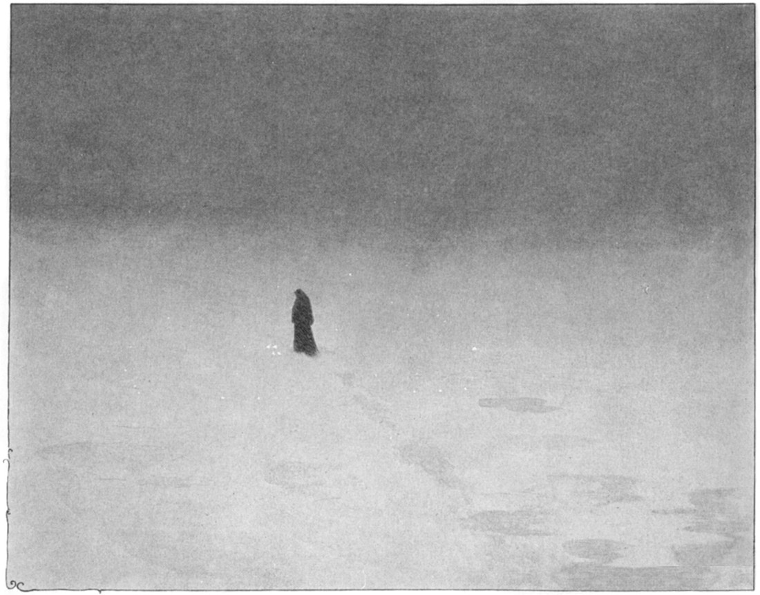
Sorrow (mirrored)
The contrast is less stark because, unlike the album-cover, there’s no complex patch of writing in the painting and the figure is moving away from what writing there is: the artist’s signature in the bottom left. In the original, the figure is abandoning identity and intelligibility by moving away from the signature. That’s why I’ve removed the signature in the mirrored version of the painting. It would be anomalous on the right, whether or not it was mirror-reversed, and it would be anomalous if it stayed on the left.
Finally, here’s a photo of two musicians in Sunn O))), the band into which Burning Witch eventually evolved:
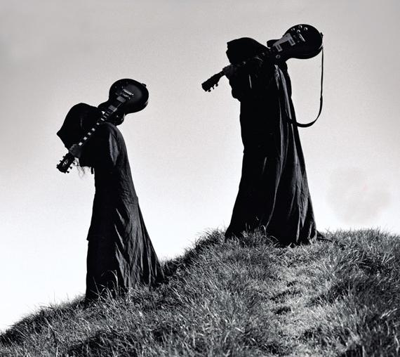
Sunn O))) in black robes
In the original, Stephen O’Malley and Greg Anderson are walking from right-to-left. Here’s a mirrored version for comparison:
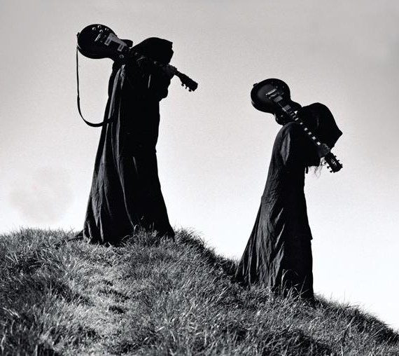
Sunn O))) photo (mirrored)
I think the original photo has more power, because the robed figures are walking against the grain, as it were — against the direction in which our Roman-alphabet-conditioned eyes read a photo.
